The original Greatest Show On Earth® celebrated its centennial by totally reimagining a circus without animals. In response, VML created a new brand that captured the fun and spectacle of Ringling’s human performers. It’s a brand identity that helps redefine family fun for a whole new generation.
Everything Under the Big Top
Reimagining the brand for The Greatest Show On Earth®
Client
- Ringling Bros. and Barnum & Bailey
Office
- United States

Ringling Bros. and Barnum & Bailey® has been bringing families together and thrilling fans of all generations for more than 150 years. But real change was needed to bring the allure of the circus into the modern world and align with the values of today’s audiences. With a completely reimagined show in the midst of a multiyear development process, we were charged with designing a reimagined brand story and engaging new diverse audiences by reinventing the circus’s rich history — without traditional icons like clowns, lions and elephants.
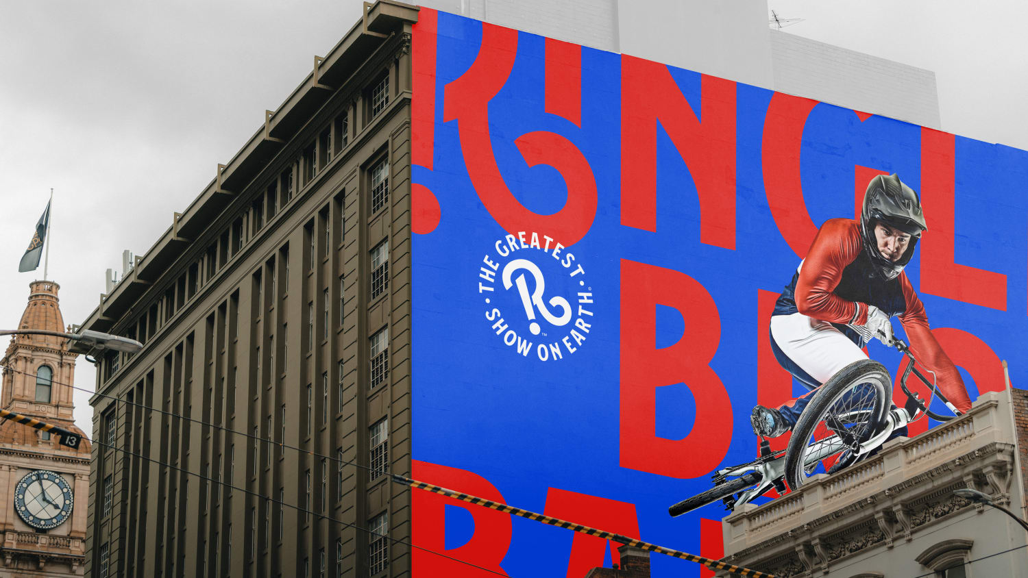
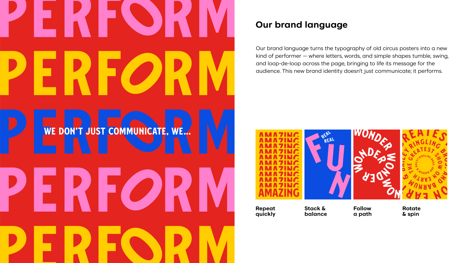
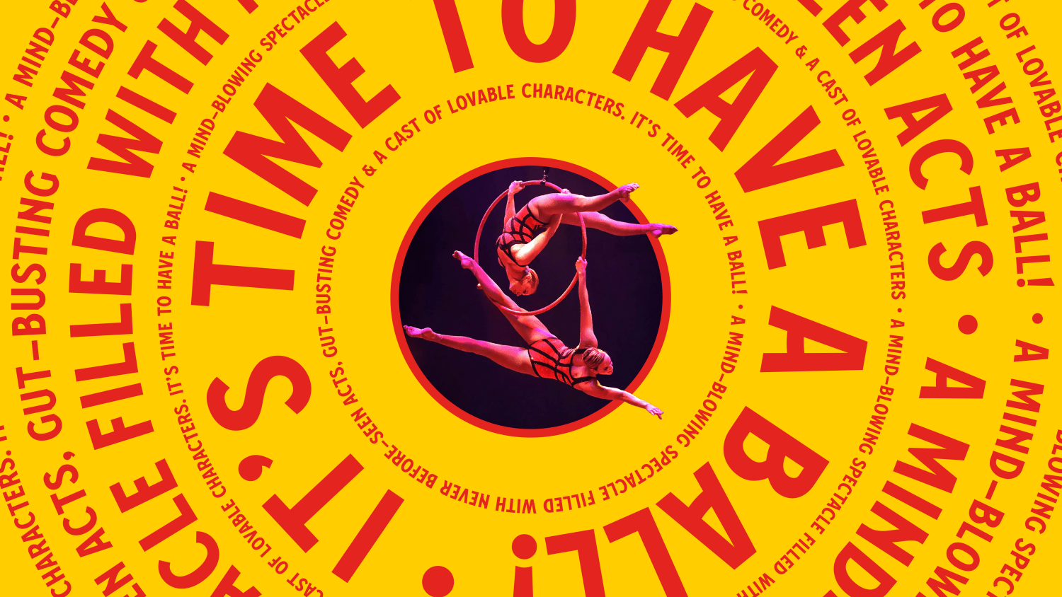
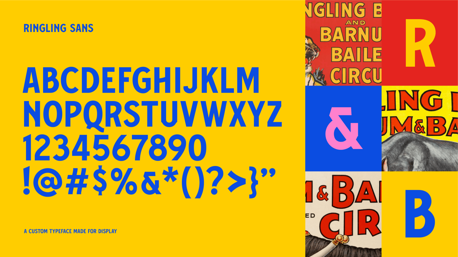
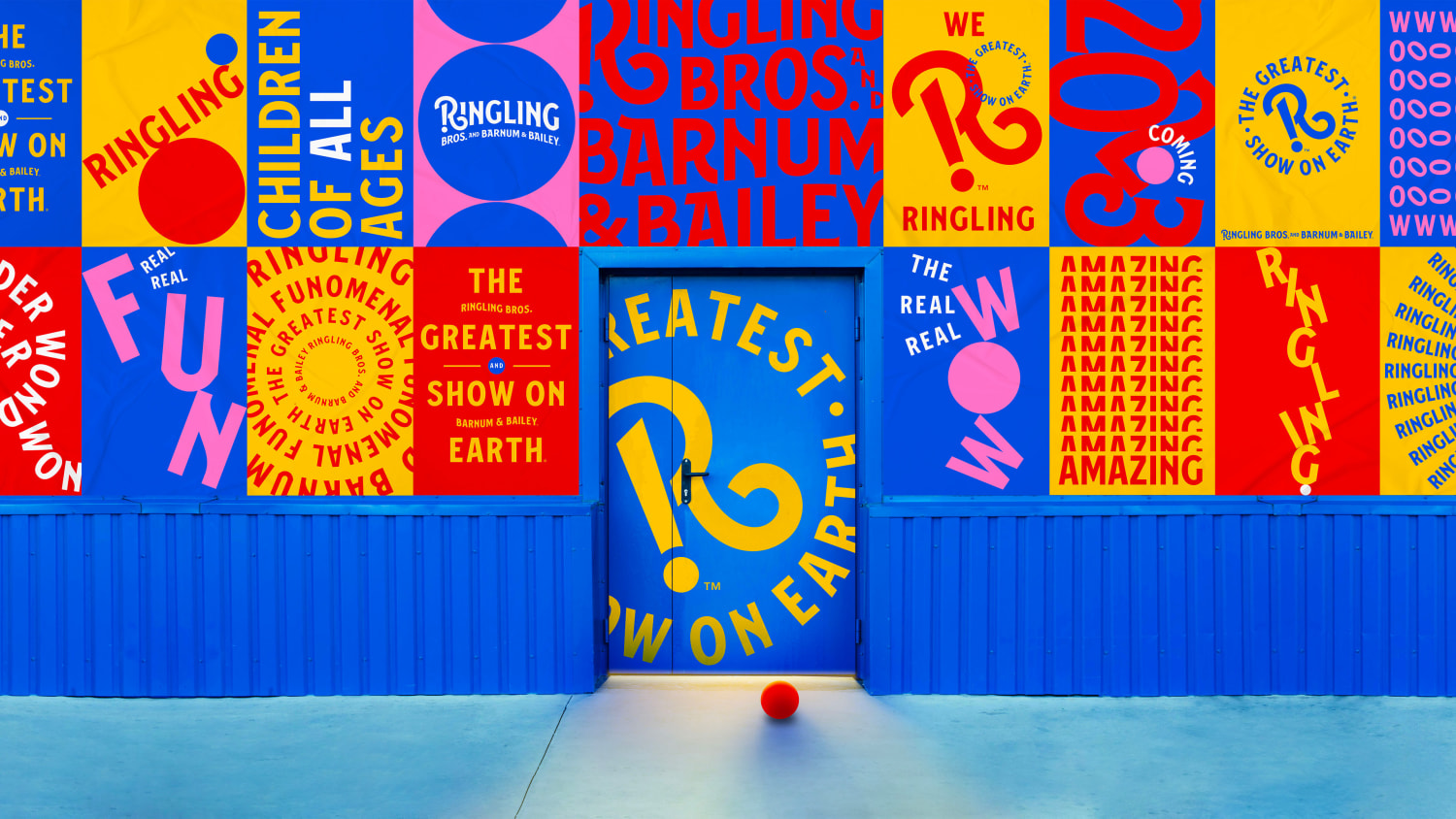
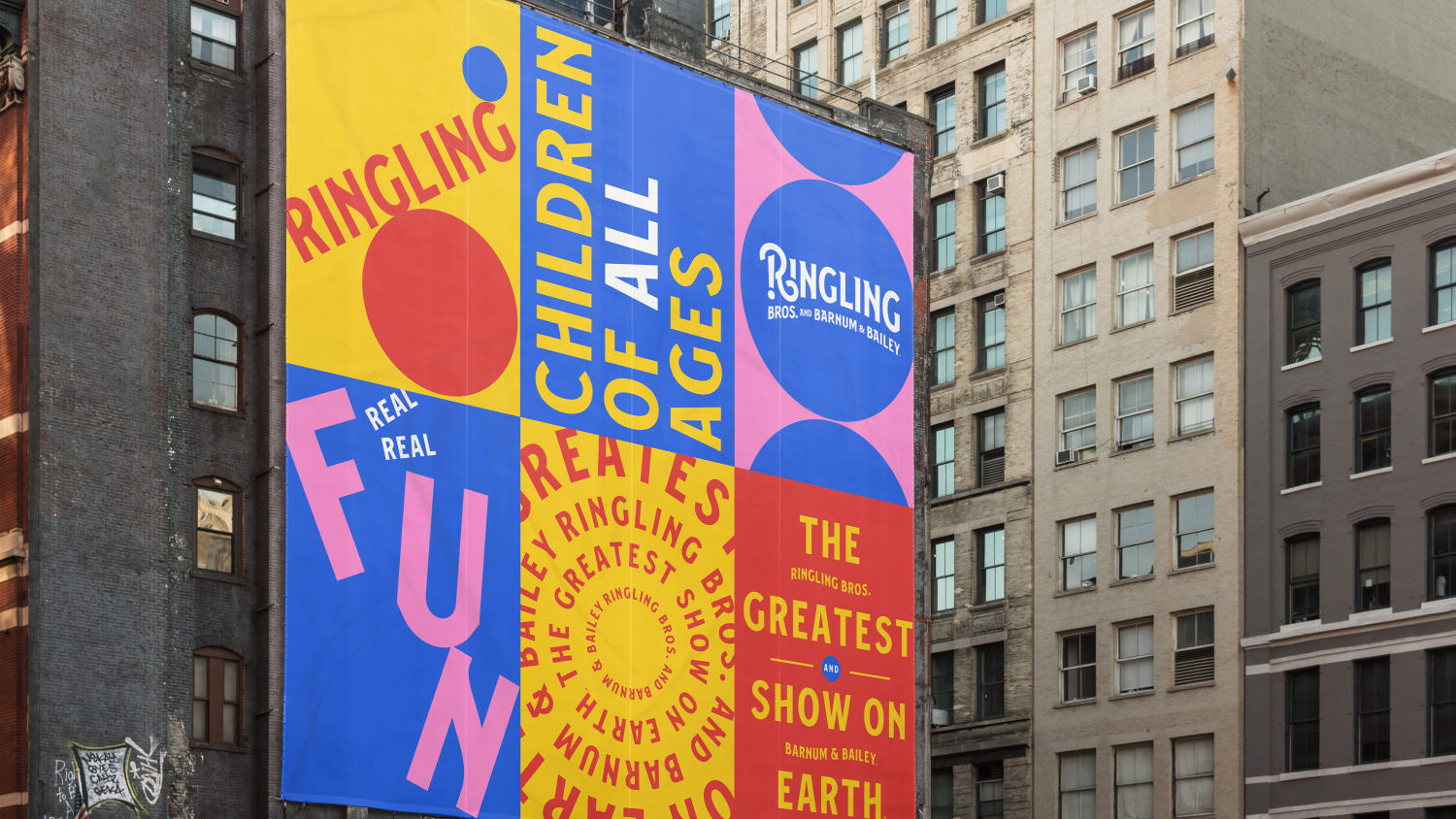
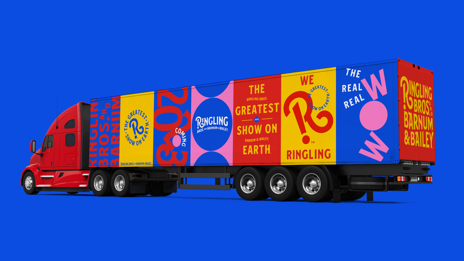
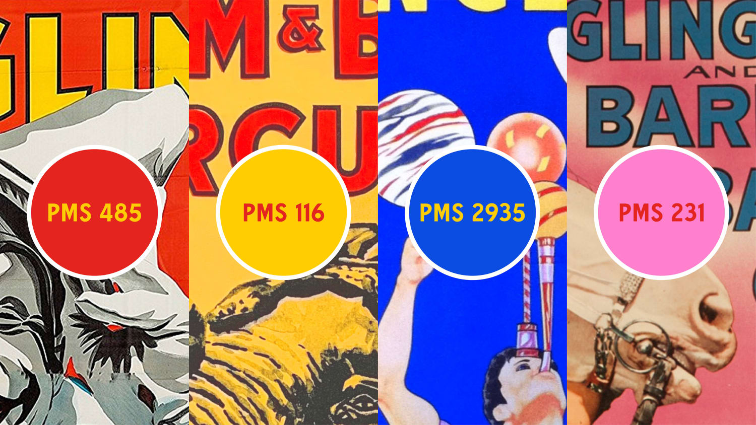
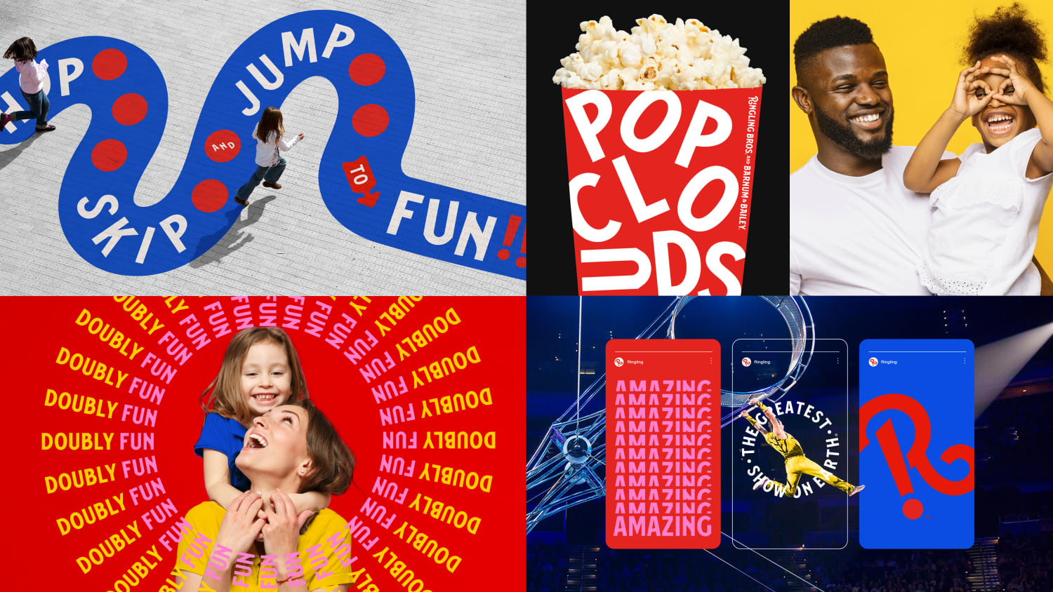
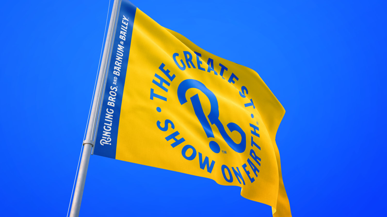
VML created a visual language that transformed the typography of old circus posters into messaging that spins, stacks, and soars in unexpected ways. It's powered by a custom, historically-inspired typeface and bold use of Ringling red, yellow, and blue. The new suite of logomarks introduces “the wow point” which has a hidden interrobang, representing both the wonder and wow of the circus in a modern shorthand. The use of wild postings nods to the advertising history of the brand. The new brand identity doesn’t just communicate; it performs — redefining family fun for a whole new generation.
The new brand launched with a special NBC News segment called “Ringling Bros. Circus Returns.” At the same time, we released a sizzle video to build excitement around Ringling's return; the result from the initial brand debut was an incredible 10 billion PR impressions and over 1,100 news stories.

