Challenge

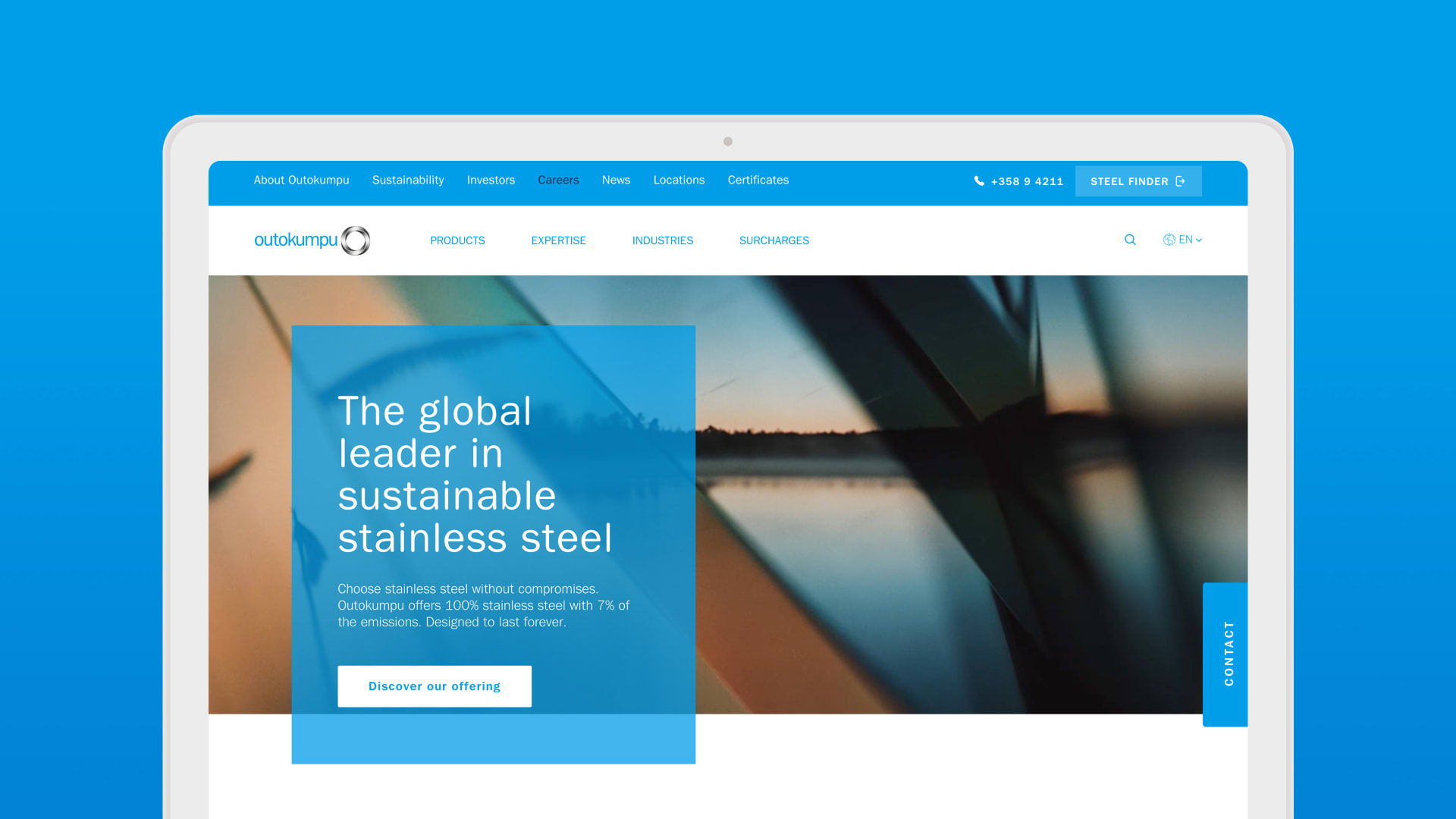
The targets were to reach 1M annual visitors to the website, convert more leads for sales and create a digital visual identity to improve and deliver a consistent brand image. The website had to be easy to use and be built to support multiple customer journeys in different customer segments.

The main areas for improvements were customer journeys and lead generation capabilities, technical quality and usability of the website. In addition, setting up effective growth marketing was also crucial since the impact of the improvements needed to be measurable through analytical tools.
Inspiration

With a multidisciplinary team, we did extensive benchmarking, tested the old site, and brainstormed during this iterative ideation phase to guide us toward a future vision.

Idea

The vision was to design a versatile, easy to use and modular site that enabled new features, content and other improvements to be published continuously.

We set out to get a holistic and objective understanding of the current Outokumpu.com user experience. We continued by identifying key customer personas, journeys and typical pain points where additional value could be created to help form the new concept.

We created digital visual guidelines for the new website and rebuilt growth marketing and analytics to improve Outokumpu’s visibility and continuously improved content. All of these boosted the user experience and lead generation for sales.

Growth

The new brand is truly expressive, memorable and relevant for its audience according to the latest brand tracking and research.​ It defined the new luxury and it is truly relatable for its audience. From the site launch, we've seen more than +136% increase in lead generation, +45% increase in visitors and +15% increase in visit duration.

Please provide your contact information to continue.

Before submitting your information, please read our Privacy Policy as it contains detailed information on the processing of your personal data and how we use it.