Milan Design Week, which ran from April 18 to 23, showcased a wide range of product and design concepts influenced by all corners of the globe. We’re unpacking five exhibit themes that leveraged consumer engagement from multiple angles.
Multi-sensory immersions and new tech perspectives stirred new conversation between exhibits this year.
Hyper-immersive spaces
Google hosted an exhibition at Milan Design Week that celebrated the visual and tactile sensations that technology can convey and transpose on a viewer. Titled “Shaped by Water,” the exhibition featured a series of installations that combined light and sound, created in collaboration with Los Angeles based artist Lachlan Turczan. The displays included pools of water in mirrored sculptures that responded to the movement around them, and a planetarium-like space with light patterns that danced with paired sounds and vibrations.
Google Vice President of hardware design, Ivy Ross, told The New York Times that exhibit is about “giving people a moment to be inspired and to have a different experience and to take pause.” Alongside the breadth of visual stimulation that week, “It’s like the space between the notes.”
Multi-sensory activations
Preciosa unveiled a “labyrinth of rhythm and light” with hand-blown crystal lights synchronized with music for a multi-sensory experience. The Crystal Grid design invites guests to take in a visual and audio-immersive concept, highlighting the house’s customizable lighting offering.
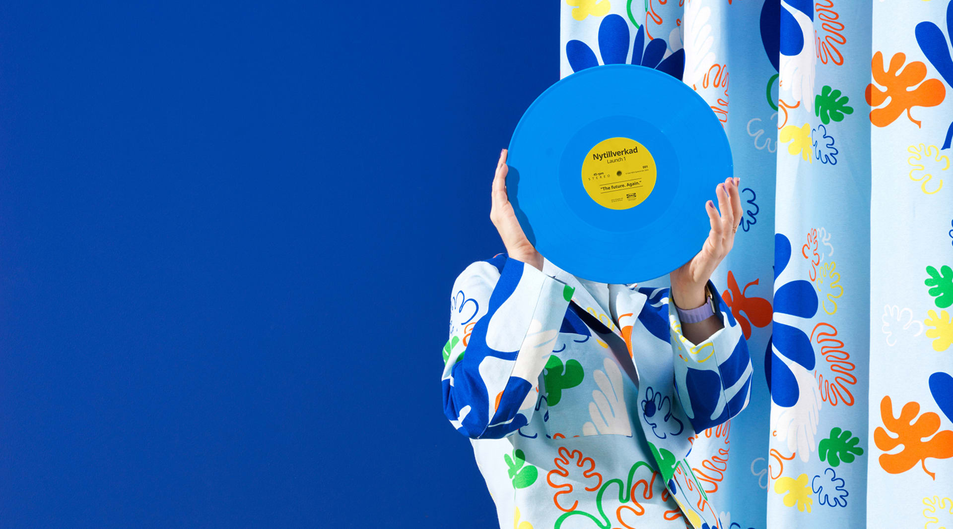
The Nytillverkad collection, courtesy of Ikea.
Playful function
Ikea’s installation, called Assembling the Furniture Together, charts the brand’s growth in home design and explores “the past, present, and future” of the home, IKEA designer and chief creative officer Marcus Engman said that week. The exhibit highlighted older designs and activations from the 70’s, and revealed “simple, functional and playful” products as part of the new Nytillverkad collection.
Thermo tech
Italian luxury men’s label Stone Island revealed limited-edition thermochromic apparel that changes shades based on the surrounding temperature. The “Liquid Crystal Heat Reactive” material ranges from yellow to blue, and is black at room temperature, forcing wearers and viewers to reconsider the way we engage with the materials around us.
AI-terpretations
Fila leveraged artificial intelligence tools to playfully recreate its logo’s metamorphosis through the years. The installation was “a visual and auditory experience” symbolizing “innovation and endless change.”
Main image from the Nytillverkad collection, courtesy of Ikea.
Please provide your contact information to continue.
Related Content


