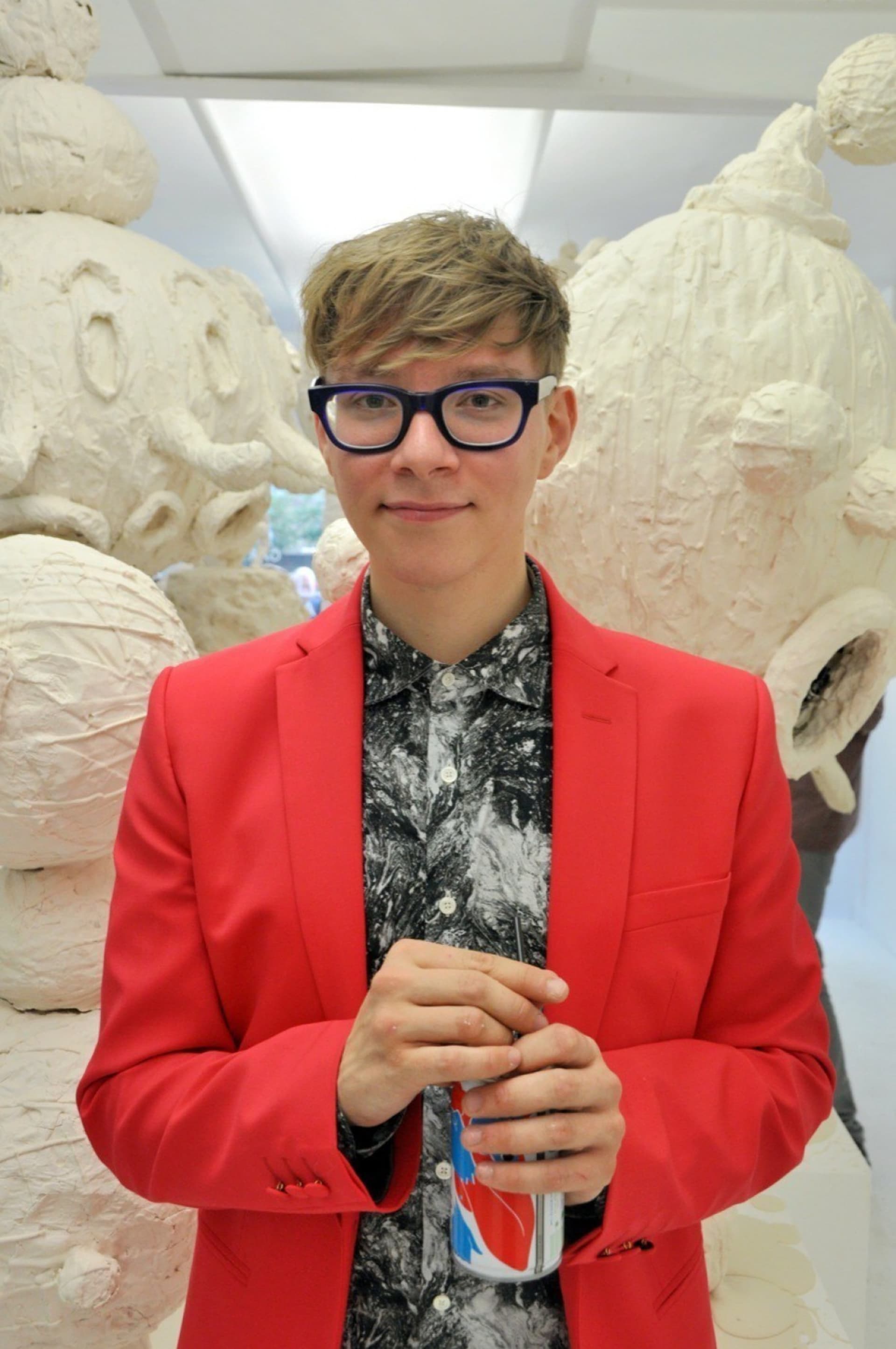
British set designer and illustrator Gary Card is well known for creating large-scale installations for fashion shows, designing costumes and headpieces for Lady Gaga, and working on retail installations and campaigns for brands including Comme des Garçons, Loewe, Hermès, Louis Vuitton, Stella McCartney and many others.

Card’s imaginative approach to store design is becoming more relevant as struggling retailers seek new ways to engage customers. We caught up with him in London to discuss how to engage an audience’s imagination, craft a memorable retail journey, and use social media to push the narrative forward.

L Si N9t Y
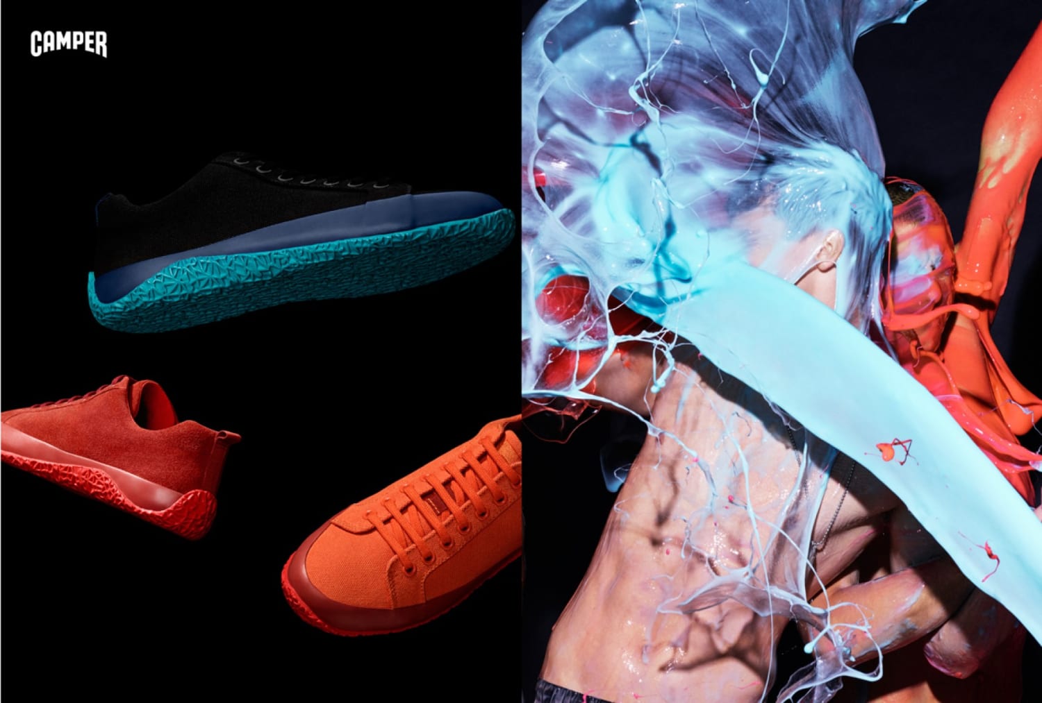
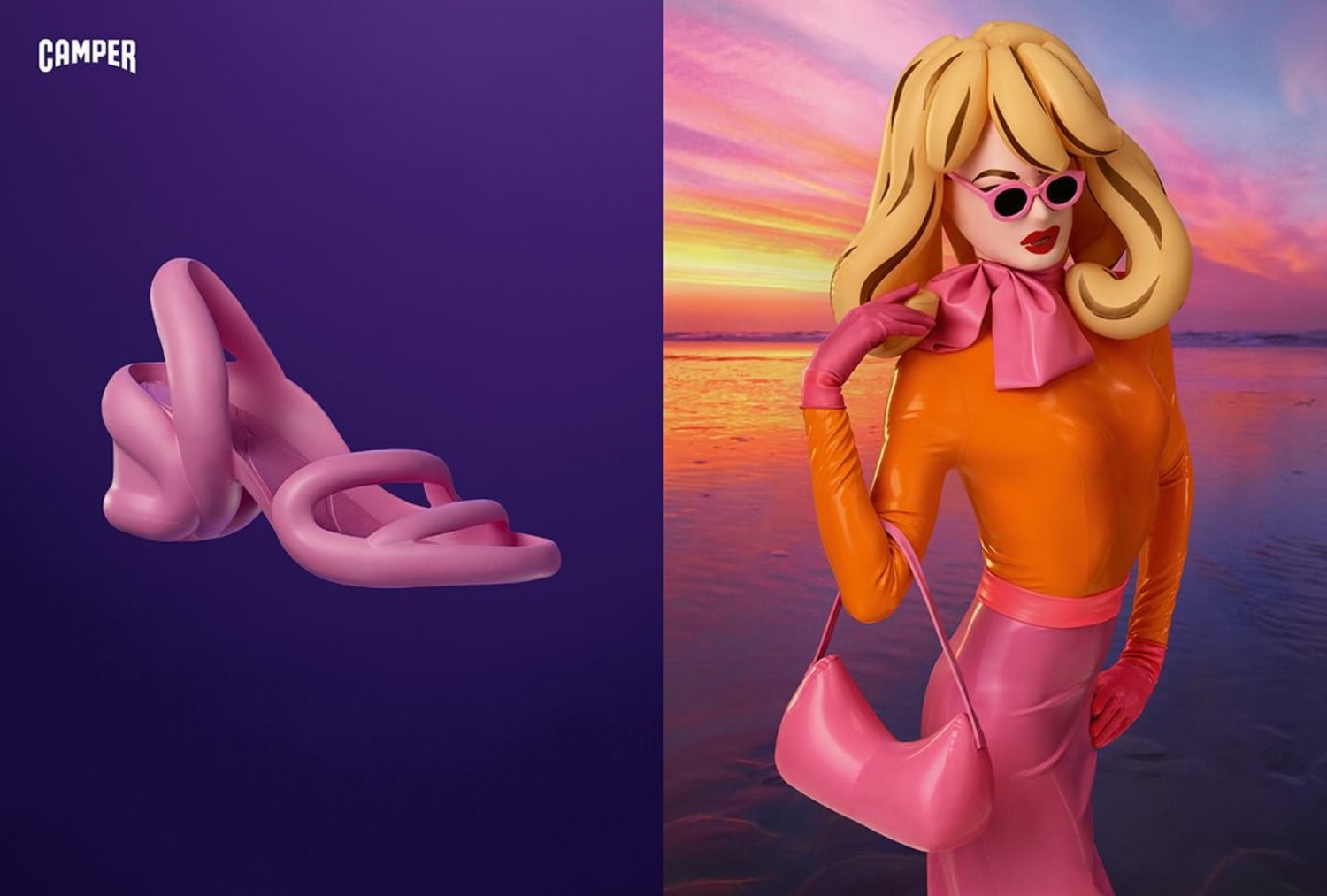
Camper campaign
169249
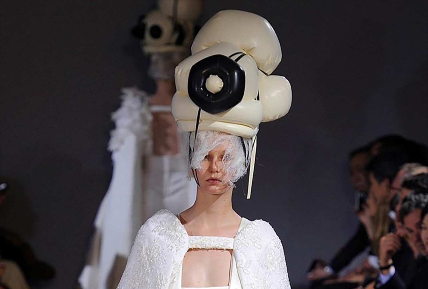
Comme des Garçons Spring/Summer 2012
Pt4yw0zp5zg7brurp0ix
Roksanda Spring/Summer 2016 Catwalk Show, London Fashion Week

What led you to become a set designer?

I studied theater, and at the time I really hated it, so when I graduated I started out doing everything but theater. From graphic design to print design to shoe design, pretty much anything I could get my hands on. That was my day job. What I was really passionate about was making things, like masks, or weird objects for people to hold. By day I was the graphic designer, by night I was mask and costume making. As the years went by it turned into one big job. Now it all goes side by side.

Your clients are predominantly fashion brands—how did that come about?

I started working in editorial, with the likes of Jacob Sutton and Matt Irwin, and started to work for Dazed and Confused, Another Magazine and iD. I worked on their props and gained credibility, and here I am now.

What changes have you noticed in the fashion industry over the course of your career?

In terms of my editorial work I think it’s a lot less creative. At the moment we’re going through a documentary phase. The likes of Harley Weir and Jamie Hawkesworth—they’re the zeitgeist, the look that everyone wants: that warm, documentary-style photography.

And so my crazy masks and the horse-ridden sets have been put on the backburner. These things go through cycles. I think the more creative stuff is further away from editorial opportunities. At the moment I’m not allowed to make the crazy headpiece or the crazy set. However, I recently had the opportunity to work on something very bonkers for Camper, which was an all-singing and all-dancing set. We were throwing slime at guys, painting people like aliens—that was a real treat. It’s been a long time since I was able to go in that direction.
Romain Kremer Camper Spring Summer 2016 Romain Kremer Daniel Sannwald 04
Camper Spring/Summer 2016 campaign

Do you see there being a shift from having imagery restrictive and stiff to being imaginative and surreal?

Yes. I think there will be a backlash to wanting something super real. People will want to push their imaginations and want a fantasy again. It will inevitably take a turn for the theatrical, the otherworldly and the more eccentric. This is why Isamaya Ffrench is doing so well now, because people are starting to get sick of natural things. Something super creative, people respond to. She’s the brat.

This sounds like the Camper spring/summer 2016 campaign you mentioned earlier…

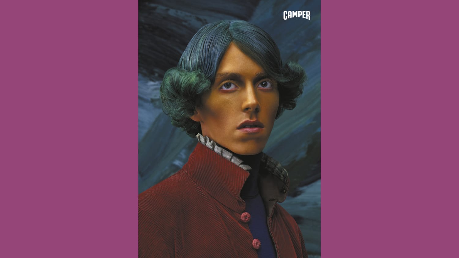
Yes! That project involved a pack of brats. In that you had Daniel Sannwald, a bonkers photographer; Charlie Le Mindu, who’s a bonkers hairstylist; Anna Trevelyan, a bonkers stylist; Isamaya Ffrench—you had the whole brat pack. And all for shoes! It’s so brave for a company that is a shoe brand that will do everything they can to go as far away from the shoe. Instead, they’re creating a story that describes the world of how they got to the shoe.

Camper SS16 Campaign Preview fy1
Camper Spring/Summer 2016 campaign
Camper SS2016 campaign 2

Has social media played a part in dictating your aesthetic approach to your work?

Interesting, actually. Everything is so immediate now. I’m not sure it’s made an impact on how I make things, but certainly social media and particularly Instagram means that there’s an awful lot to make, because I need to consider more platforms than before. When I work on a fashion show it used to just be about the press shots, but now because of social media everybody has their own interpretation of the set, and now I need to make every conceivable angle look fantastic.

Any particularly memorable recent projects you’ve worked on?

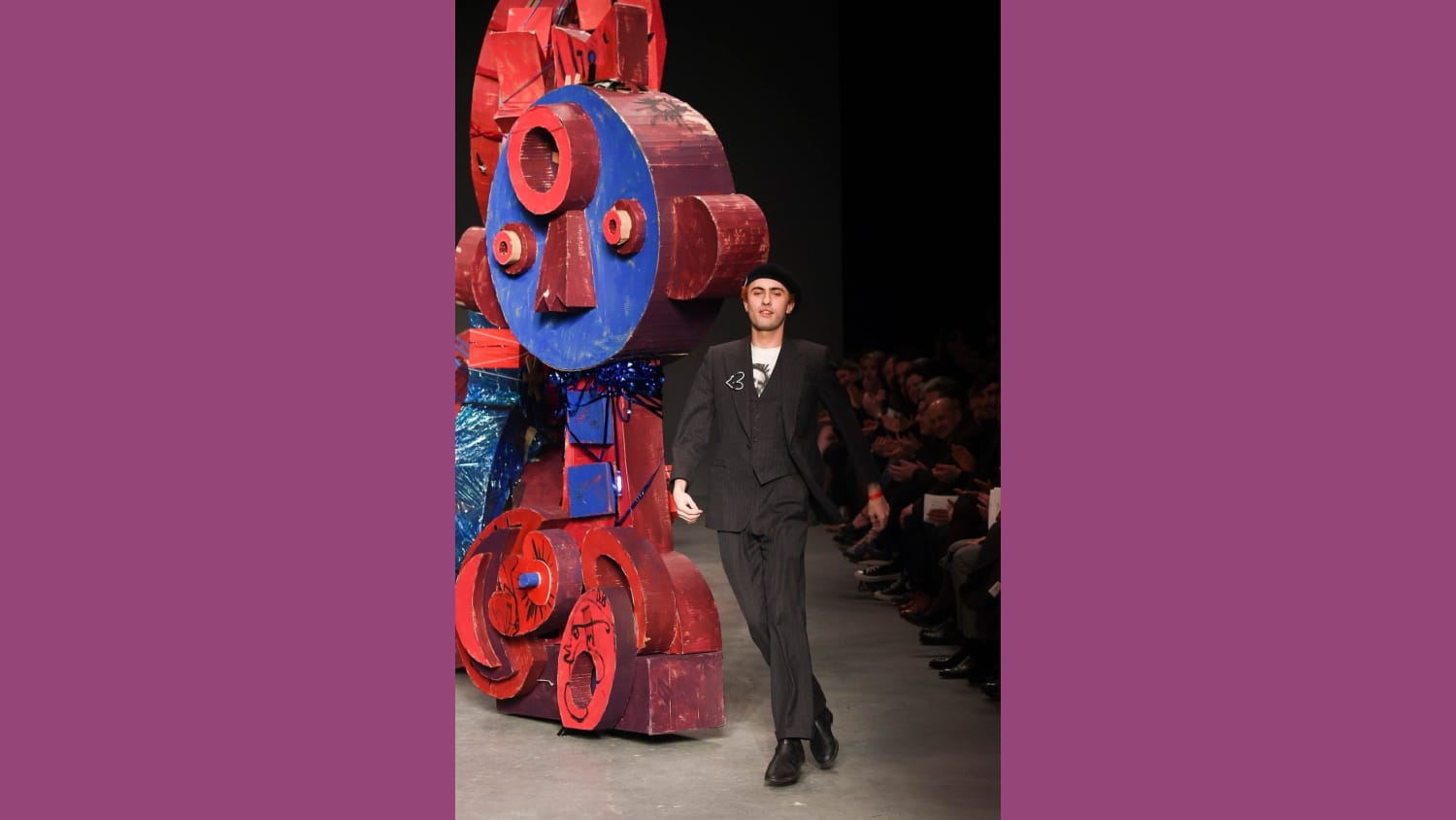
The most spiritually satisfying project I worked on recently was for a menswear show for a young designer called Charles Jeffrey—he’s not just a brand, he’s a movement. He hosts nights called Loverboy and it’s amazing. So we started discussing the set design for his menswear show, he’s an illustrator as well and we discussed bringing these to life. I added tactility, rope, plastics, paints, everything we can find from the streets. This job was so gratifying because there were no limitations. Apart from trying to bring the piece onto the set which was really hard. The piece was 20ft in the air. It was perilous to falling onto the crowd and killing the front row, it was total chaos, which was great. That was Loverboy.

1452374762 cb7a59aeed4a4053d6e535a5cd4bdaf9 600x888
Charles Jeffrey Loverboy Autumn Winter 2015 show
KIM 0851

You have created a lot of retail sets for a variety of brands, from Comme des Garçons to Hermès. How do you create a journey for someone within a retail space?

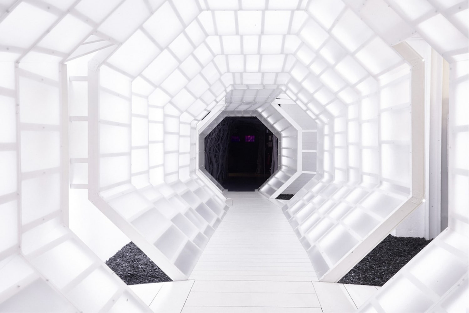
The best example I worked on is for LN-CC—it’s a great example of taking someone through a journey. About six years ago I was approached by friends who came to see a show where I made a big corridor made out of plasticine, three tons of white plasticine modeled into thousands of faces, along a hexagonal tunnel. They loved it and wondered if I could take that tunnel and make it the heart of a shop they were making.

I was super excited about it but I couldn’t quite understand because they were an online retail space. But then I loved the idea that you shopped online and then you had this physical experience where you could just hang out. It was not about shopping, it was about having a drink, socializing, having a dance, going there in the evening to watch a DJ, going to the library and reading the books.

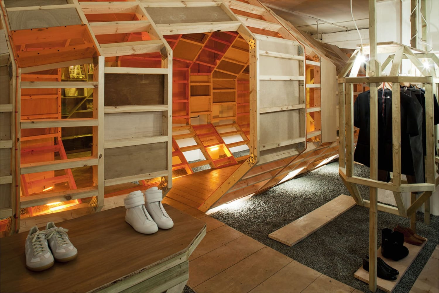
I created a labyrinth taking people through different types of feelings, using different temperatures and different textures. Going from concrete to acrylic to wood. Going from hot to cold. From warm light to cold light. All of these different themes. The temperature of your feelings will constantly shift throughout the space. It’s about the retail experience, which will turn into sales.

LNCC London Design Journal
TUNNEL High Res 54 990x660 201404240109
Lncc5
LNCC, London

Please provide your contact information to continue.

Before submitting your information, please read our Privacy Policy as it contains detailed information on the processing of your personal data and how we use it.

Related Content

ANA
News

VML Earns Three Wins at 2024 ANA Multicultural Excellence Awards

Campaigns from VML Canada and VML Argentina honored for groundbreaking work in LGBTQ+, People with Disabilities, and Holidays & Milestones categories
Read Article
Josh Loebner Headshot
In The Press

Creative judging and accessibility—lessons from a Cannes Lions jury room

VML’s Josh Loebner, PhD showcases the value of more disability visibility among creative jurors
Read More